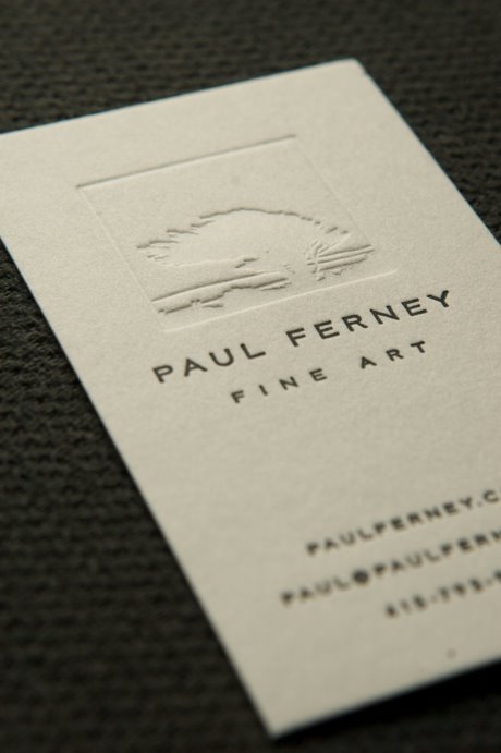
Paul ran out of business cards so I printed some up for him last week. He wanted something subtle so we did a blind deboss for the picture and then did the text in Pantone 546. In case you didn’t know Paul paints some really beautiful pictures. The design was based off the painting below.


Bri
June 4, 2009
These are lovely. Subtle and elegant. And a good use of uninked letterpress (or however you would describe that!)
Jane Flanagan
June 4, 2009
Beautiful. So very subtle and elegant.
liz stanley
June 4, 2009
they turned out beautiful. good work.
Helen
June 4, 2009
Wow, these are breathtaking … as are Paul's paintings. Love that you used that particular tree.
Rebecca
June 4, 2009
So fresh and clean.
Sarah
June 4, 2009
Really lovely.
LeniStav
June 4, 2009
wow, amazing job!
Virginia
June 4, 2009
What a beautiful painting.
michelle m
June 4, 2009
I LOVE his work!! Your blog is somethin' special too.
lillie
June 4, 2009
What a lovely abstraction of his art. Subtle, elegant, beautiful!
Sarah's Fab Day
June 4, 2009
These are beautiful.
Chris
June 4, 2009
The cards are gorgeous, and that painting is incredible.
Joanna Goddard
June 4, 2009
oh jordan, these are so beautiful! i'm amazed that you can just whip them off 🙂
abby
June 4, 2009
WOW. best bidness cards ever. lucky paul.
Diana Hulme
June 4, 2009
these are gorgeous! what a dream…to just whip out some letterpress goodness…love it. 🙂
Rebecca
June 4, 2009
wow. great job– the resemblance between the two trees is uncanny!
amber {daisy chain}
June 5, 2009
perfectly subtle – and totally lovely.
seesaw designs
June 5, 2009
These look really really great, I love them.
-Angela
easytravel
June 5, 2009
great picture. I like it. see you on myblog.thanks
Clarity
June 7, 2009
Beautiful cards, I really like the classic understated font and lettering.