I cannot say enough good things about the Mom 2.0 Summit. I met so many amazing people and learned so many new things. Mark your calendar for next year, it will be in Houston again. If you are into blogging or marketing at all it is not to be missed. I’ll do another post on the conference later this week.
I got so excited about blogging that I got home and did some housekeeping around here and gave Oh Happy Day a new look. It is basically the same just a little bit cleaner and easier to navigate. There are lots of things I’ve been meaning to update or improve for a long time and I finally bit the bullet, sat down at the computer and did it. I’d love feedback on the new layout if you have any.
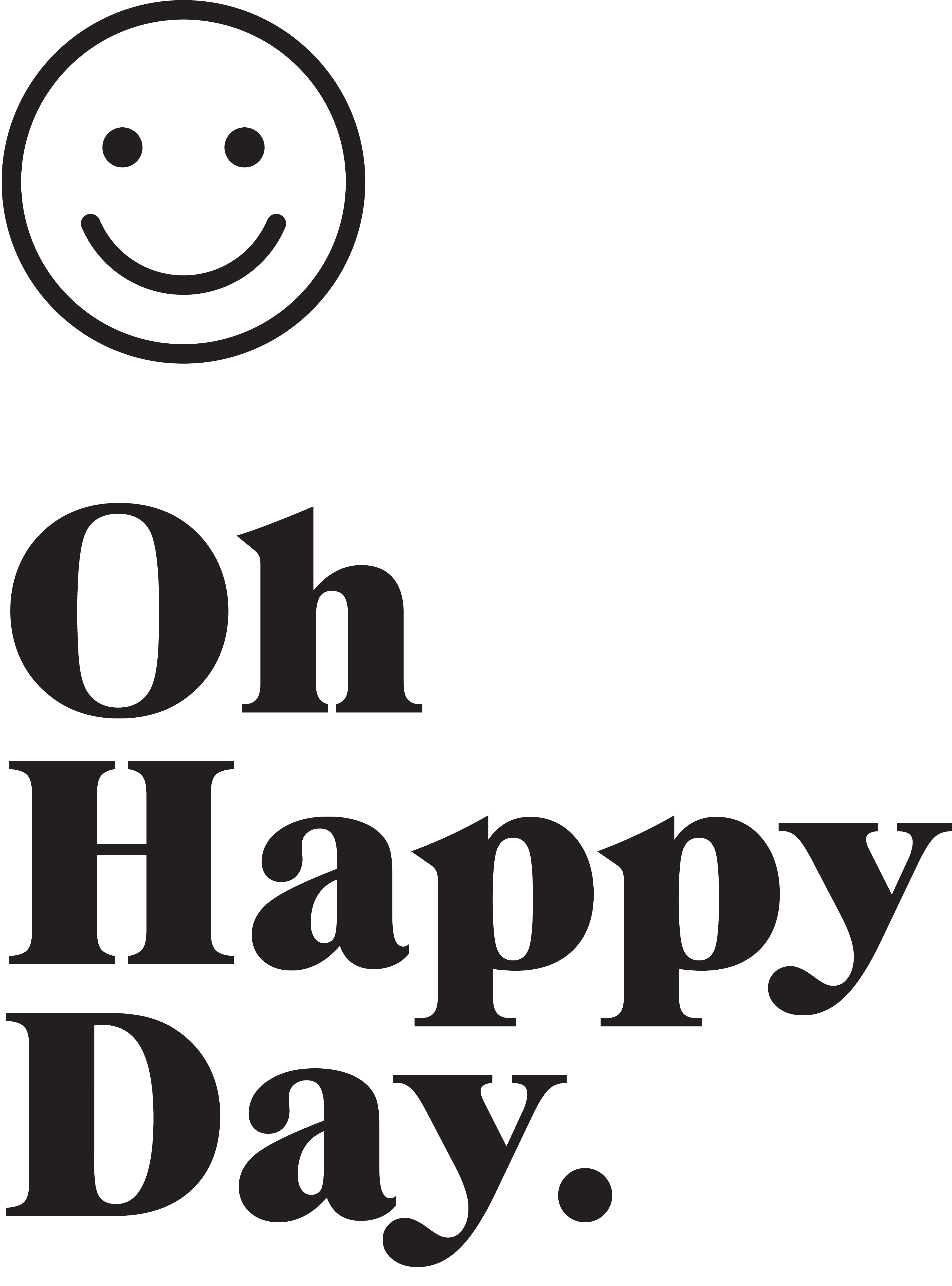
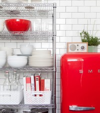
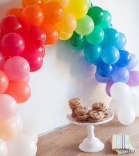
photos via Martha Stewart











Jill
February 23, 2009
it looks great! i love the clean + simple look. a light vertical divider between the left/middle/right columns would be nice.
jordan
February 23, 2009
Thanks Jill, I think you are right. I’m looking into it. 🙂
Chelsea
February 23, 2009
I love it Jordan!!
Lindsey
February 23, 2009
I think it looks great!
Sarah
February 23, 2009
I love the new layout, very sleek and professional looking. I’m looking forward to hearing about the conference as well!
Jennifer
February 23, 2009
Looks lovely and glad to hear that Houston was great-will plan on it for next year.
Jane Flanagan
February 23, 2009
It’s beautiful!
Tiffany
February 23, 2009
Looks very nice!
Laura
February 23, 2009
Looks really good! I like that you kept your bicycle. Do you think you’ll ever archive your posts by topic?
Lauren Knoop
February 23, 2009
I like it but I miss the stripes. Maybe a little pattern somewhere?
paula
February 23, 2009
i love the new layout and header. Just perfect.
kathy
February 23, 2009
I love it!
robin k
February 23, 2009
Awesome, Jordan.
Geneva
February 23, 2009
It’s beautiful!
michelle
February 23, 2009
Very nice! I like the white look 🙂
k8theriver
February 23, 2009
i liked knowing what links were family and friends. but i understand that it might be hard to determine which category to put people in.
i like it.
Chantal
February 23, 2009
I like it but I miss your bicycle dude! I loved that guy!
Mary Elizabeth Liberty
February 23, 2009
without your signature colors the ads are now a tad overwhelming!
Michelle
February 23, 2009
It looks great Jordan!
Stephanie
February 23, 2009
I love it. Can’t wait to see the portfolio!
simply seleta
February 23, 2009
Very chic and crisp. Love!
mdcano
February 23, 2009
i like the ‘cleaner’ version but i’m sure the PaulF header wasn’t there this morning – am i right?
i like it on the left only as your name/logo really took presedence.
(only because you asked)
summer
February 23, 2009
absolutely wonderful.
the new look is stunning.
clean, bright, & seamless.
love it!
kim
February 23, 2009
I like the new look. I think the title “Oh Happy Day” should be larger and your name (the author) should be smaller and off to the side. Just two cents from someone you’ve never met so take it for what it’s worth! 🙂
i suwannee
February 23, 2009
it’s a little too wide for my browser. i have to scroll over to see the whole thing. i’m on a big screen…
Genevieve
February 23, 2009
I really like it. I’ve loved your blog all along, but I like this fresh aesthetic and a easy layout–very crisp and inviting. Well done.
becky
February 23, 2009
oh hallelujah! you finally made your title a hot button so I don’t have to open each new post when you update each day! it drove me CRAZY for years! super new look.
seesaw designs
February 23, 2009
It’s looking really great!
Sarah
February 23, 2009
I love the new header! Did you design it yourself?
I would like it if your links section was alphabetized and also if you archived your material by topic and had links for those on the side as well.
jordan
February 23, 2009
Thanks everyone for the comments and suggestions. A few notes:
-Since Oh Happy Day has never been available as a url people are always confusing the title and my name. So I decided to change the title to Jordan Ferney and the tagline to be Oh Happy Day.
-There will be subjects but that is a few months away. I started blogging when tagging wasn’t an option on blogger so I’ve never done it.
-It needs more color I’m figuring how to incorporate it.
-I’m reorganizing my links, that will be done by tomorrow.
Baboon
February 23, 2009
I miss the old layout…it had more personality. Your blog is now a bit “standard”.. 🙁
humayun kabir
February 23, 2009
nice ..i like this story
ashlynn
February 23, 2009
I miss a little pattern as well – you don’t want to look like the blogs out there that have nothing {mine}. You’ve got skillz so show it off.
Holly
February 23, 2009
i love the header but do miss the color!
lesley
February 23, 2009
i love your blog, and i quite enjoy the crisp clean aesthetic. you always have lovely photos, so i think this is a nice way to show them off.
my only thought is that i like when links within the text open into a new window. that’s just my personal preference, as i often like to look at several links from a blog, but also want to keep reading the rest of the blog’s posts after i’ve hit a link. [really wordy, sorry!]
Cathy
February 23, 2009
Ahhhh. Like opening a window on a spring day. Love it.
Courtney
February 23, 2009
Oh I wish we could have met up (darn me leaving early on Fri!) and I wish I could have made it to the summit – sounds great! The new look is super clean and refreshing.
wide open spaces
February 23, 2009
don’t you love opening a can of worms and getting all the different opinions! i actually REALLY like the white background. i always think ads on blogs look funny when then don’t blend with the background. i love your new header, too.
Deb on the Rocks
February 23, 2009
You rock. I came home and slept.
jakedonohoe@yahoo.com
February 23, 2009
look is fabulous.
veedaloca
February 23, 2009
I like the clean look too. Nice job Jordan.
Annabanana
February 23, 2009
very nice new look
Janelle
February 23, 2009
i miss some of the yellow, too
Anonymous
February 23, 2009
i think your new page lacks the personality that your other had. keep working on it.
layersofmeaning
February 23, 2009
love the new look!
eva
February 23, 2009
love the new format!
Heather
February 23, 2009
I really love the new look!
Melissa Jade
February 23, 2009
holy god- those advertisements could not be more distracting!
Anonymous
February 23, 2009
the ads are really distracting. in my opinion, it makes the site look less clean. I also miss the vibrancy of the color. It’s definitely more corporate.
Kara
February 23, 2009
I like it Jordan…. but now I seem to notice the adds more. Oh well.