


Oh Happy Day is about to celebrate our 2-year anniversary of being in our studio in San Francisco! We’ve made a bunch of edits to the inside (remember this?) but the exterior of the building has always looked a little sad. So this summer, we decided it was finally time for a makeover…

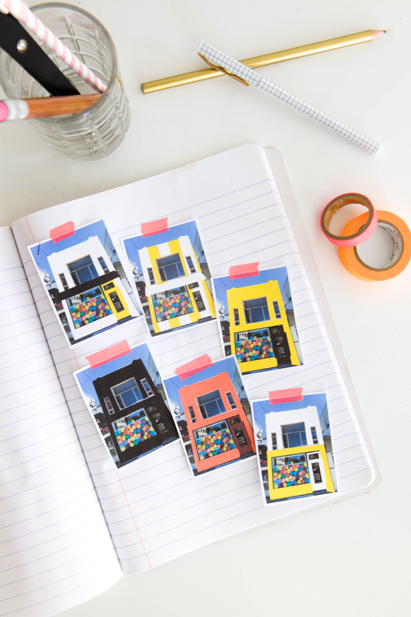
… and a fresh coat of paint! To figure out what would look best, we first took a photo of the building and then tested out a bunch of color options in photoshop. We tried everything: all-black, yellow on the bottom and white on the top, black & white stripes. Then the whole team voted on what looked best.
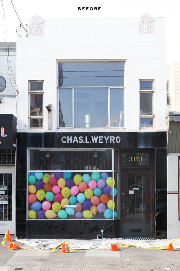
Here’s what the studio looked like before:
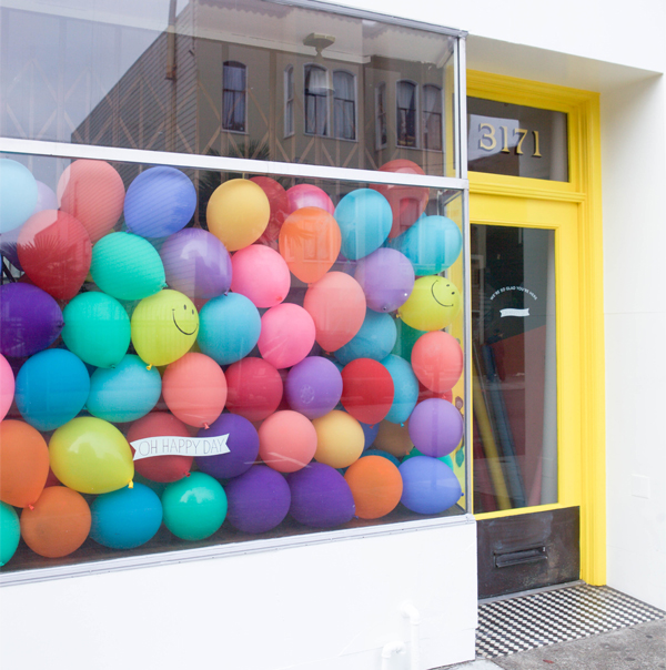
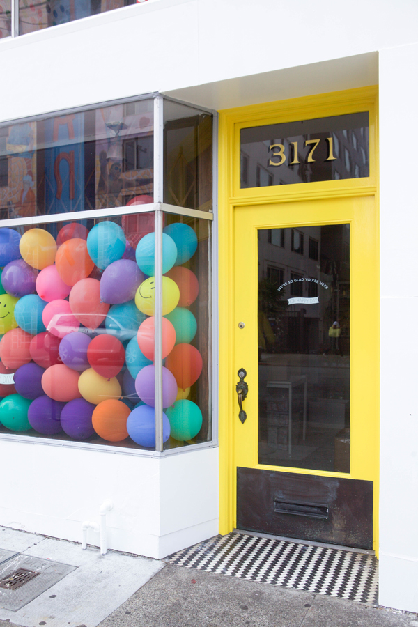
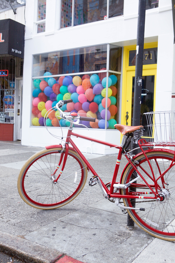
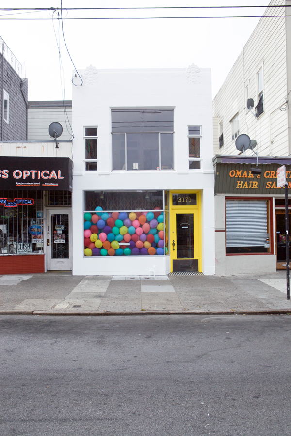
And here’s what it looks like now!
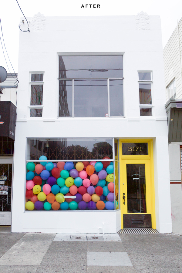
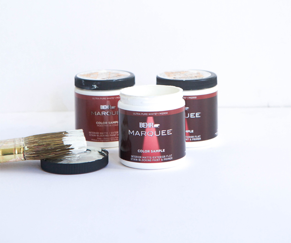
We love the way it turned out. For paint, we decided to use Behr’s new MARQUEE Exterior Paint and primer available exclusively at The Home Depot. It’s dirt-resistant and can be easily wiped clean (which is incredibly helpful in the city). We picked out a few of our favorite colors (like Coconut Twist, Swiss Coffee, Polar Bear, & Night Blooming Jasmine) and got samples to paint large swatches on the outside of the building. It made it easier to decide because we could see how the colors looked on a larger scale.
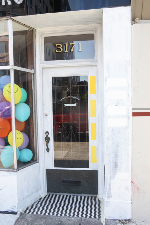
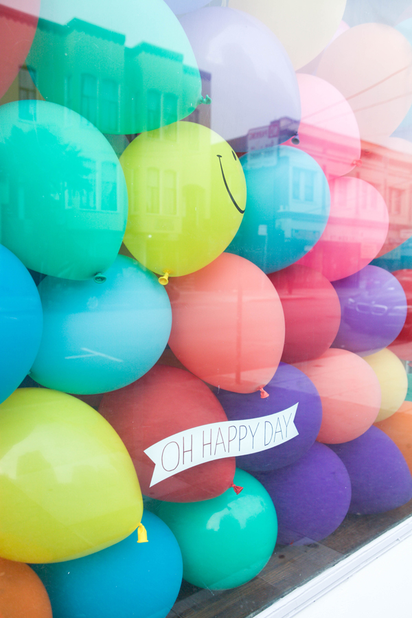
We hired a team to help with the prep and painting, and it took about 3 days to get totally finished. We should’ve done this sooner! Now that the building is all white, the balloon window is way more impactful and we notice all the special details (like the black and white tiling in the doorway). It’s amazing a fresh coat of paint can change things so much. Do you have any fun painting projects coming up??
![]()
This post is brought to you by BEHR. Color that’s True to Hue. If you feel it you can find it. Visit truetohue.behr.com
Photos by Alison Piepmeyer for Oh Happy Day


Melissa
August 5, 2015
who is chas. L Weyro? I liked the old font and sad it’s been covered up.
I love sign painting and a little piece of history was wiped out. Totally OHD’s prerogative—I get it. But I have to admit it hurts to see it white-washed and left plain on a whim.
I know! I loved the chas l weyro lettering too but the landlord was going to stucco over it anyway. It wasn’t really our decision. Ps: chas was a real estate agent.
Got it! I really appreciate knowing this—thanks!
I thought the same thing about the old lettering, so sad! I’m glad Jordan explained… surprised you didn’t mention that in the original post. (Even if he was just a real estate agent!) The white and yellow look great though.
Fair enough! It does look amazing and fresh. It’s obviously all about the yellow door.
Heather
August 5, 2015
This is beautiful. Good work guys!
Anne
August 5, 2015
Congratulations guys! This looks really awesome. It honestly looked even livelier and brighter today. Among the color tests you’ve shown, I happen to like your final choice and the striped one. Those two would be a tie for me. 🙂
http://annescribblesanddoodles.blogspot.com/
Lauren
August 5, 2015
So beautiful! Love the pop of yellow on the white!!!!
kristin | W [H] A T C H
August 5, 2015
i just love the yellow door!
Three Cheers + Co.
August 5, 2015
How fun!! Love the yellow and white and the balloons in the window are so fun!
susan | fleurishing
August 5, 2015
I was there on Sunday – we stopped by on our way to the airport!! Looks awesome…next time I would love to say hello + get a tour! I didn’t reach out since I knew you were on vacation. 😉
BArbara
August 5, 2015
Wow, what a difference! The white really does bring out the black and white tiles in the entrance. I barely noticed them before.
Gabriella
August 5, 2015
It looks fantastic! I love how bright the façade is now! Amazing work.
g.
Sarah
August 5, 2015
It looks so much better, Jordan! Love it. Perfect.
Christina
August 5, 2015
It’s beautiful! I love it!
Christina
http://www.cityloveee.blogspot.com
Mary
August 5, 2015
Do you mind sharing what the name of the yellow paint is that was used? Looks amazing!!!
Eleigh
August 5, 2015
Love this look! The bright yellow goes really well with the happy face balloons 🙂
carrie
August 5, 2015
It looks wonderful!
Carrie
http://www.wearwherewell.com
Lindsay
August 5, 2015
Looks great! Have you thought about black and white striped awnings over the large windows? It would tie-in the tile detail.
That’s a great idea! The building needs just a touch more definition.
Traci Barr Segal
August 5, 2015
So cheerful??! I’ve often walked by with my sweet boxer girl. I do think the black and white awning idea is terrific.
Laura
August 5, 2015
Oh my gosh, I just love this so much! The yellow door is amazing, and I agree that it makes that black and white tile really pop. One tiny thing: I think your Oh Happy Day decal on the front big window should be that same pretty yellow to tie in with the door — and much bigger!
Paige
August 5, 2015
I love that bright yellow door! It’s so cheery and inviting from the street! And those balloons are so fun!
Paige
http://thehappyflammily.com
Emily S
August 5, 2015
My sister is in the process of picking a new paint for her house front door. She actually texted me swatches across the country to help decide! lol. I told her to use photoshop too! I have such a hard time making big decisions so I try things in photoshop frequently. I was sad about the lettering too, but the yellow door is great!
eemmllee.wordpress.com
Bella B
August 5, 2015
I would love to visit one day. The makeover looks adorable!
http://www.xoxobella.com
Hubertienne
August 6, 2015
I love the yellow door!! All my bedrooms & bathroom doors are yellow. It’s really such a happy color.
Joana Marques
August 12, 2015
Yellow! THE smarter choice!
Alison
August 15, 2015
Was the bottom half of the building marble? I’m surprised paint would adhere well to that without significant “roughing” of the marble.